Start a project
All work

Concept Branding studio · Rotterdam · 2026

Mullion

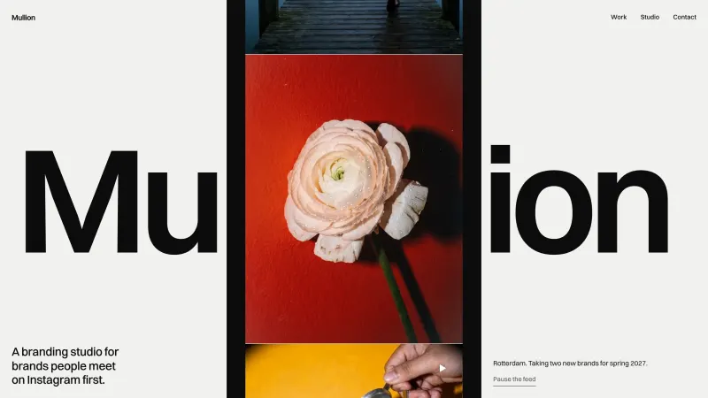
A branding studio for brands people meet on Instagram first, where the two l's in the name are the grid.

Recorded from the live site at mullion-studio.vercel.app

The brief

Mullion designs the identity and the Instagram grid at the same time, because that is how its clients are met: three posts wide, on a phone. The site had to prove the studio's eye in ten seconds and let the name do the explaining.

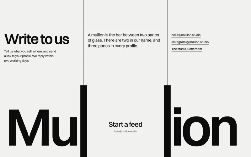
Mullion is a fictional branding studio in Rotterdam for hospitality brands and small makers whose first storefront is an Instagram profile. The brief I set: show feeds, not logos, and build the whole site out of one fact. A mullion is the bar between two panes of glass. There are two in the name, and three panes in every profile.

Type
Concept, self-initiated
Role
Concept, Brand identity, Art direction, Web design, Development
Built with
Astro, GSAP, Lenis, Vercel
Typefaces
Switzer

How it was made

  1. The name is the grid

    The two l's of the wordmark are plain vertical stems in Switzer. On the opening they grow to full height and slide apart into the two lines of a three column grid, and those lines run the full height of every page.

  2. The imagery brings the colour

    Glass grey and ink, with no accent at all. Each client's feed carries its own colour, and the page takes a faint tint of whichever feed you are looking at.

  3. Things post, they never fade

    The motion verb is posting: new work enters top left and everything shifts one pane along, the way a profile does. The hero feed keeps posting on its own while you read.

Mullion: Three posts wide

Chapter 1 of 4

Three posts wide

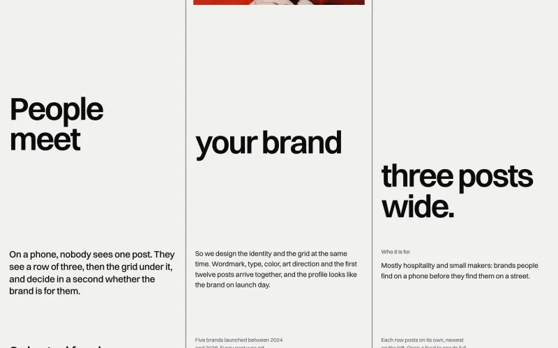
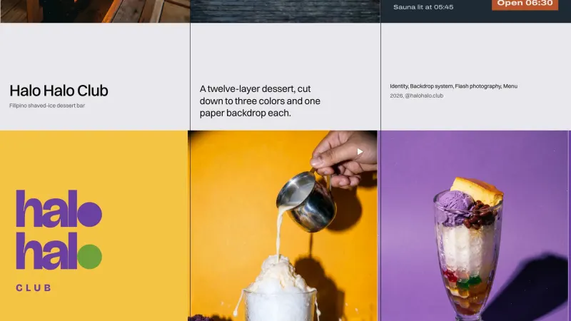
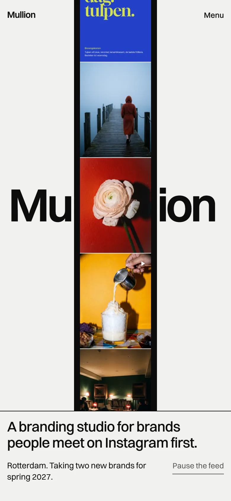
On a phone nobody sees one post. They see a row of three, then the grid under it, and decide in a second whether a brand is for them. So the studio's whole pitch is that identity and feed are designed together, and the site says it in one line before anything else.

Mullion: Feeds, not logos

Chapter 2 of 4

Feeds, not logos

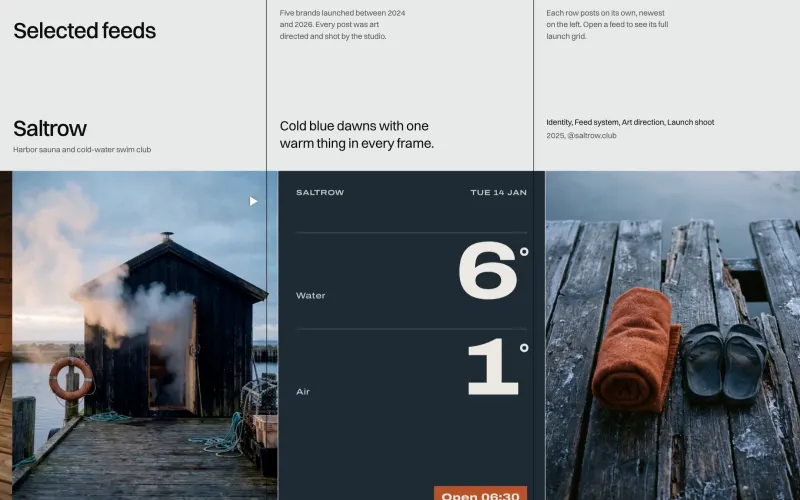
Every client is shown the way people actually meet them: as a profile. Saltrow, a harbour sauna and cold water swim club, gets cold blue dawns with one warm thing in every frame, laid out as its first rows of posts.

Mullion: A rule for every brand

Chapter 3 of 4

A rule for every brand

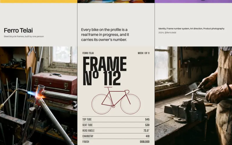
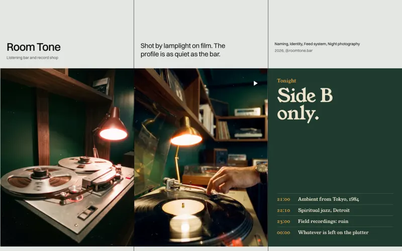
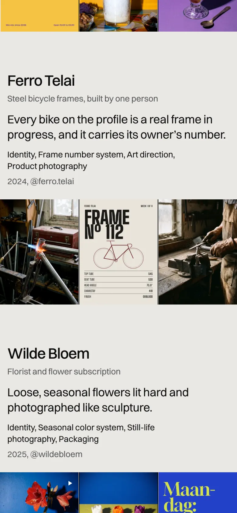
Each feed runs on its own rule. Ferro Telai's bikes each carry their owner's frame number, and Room Tone is shot by lamplight on film. The rule is what keeps post forty looking like post one.

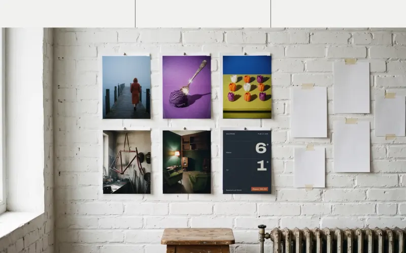
Mullion: Proof on the wall

Chapter 4 of 4

Proof on the wall

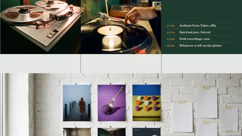
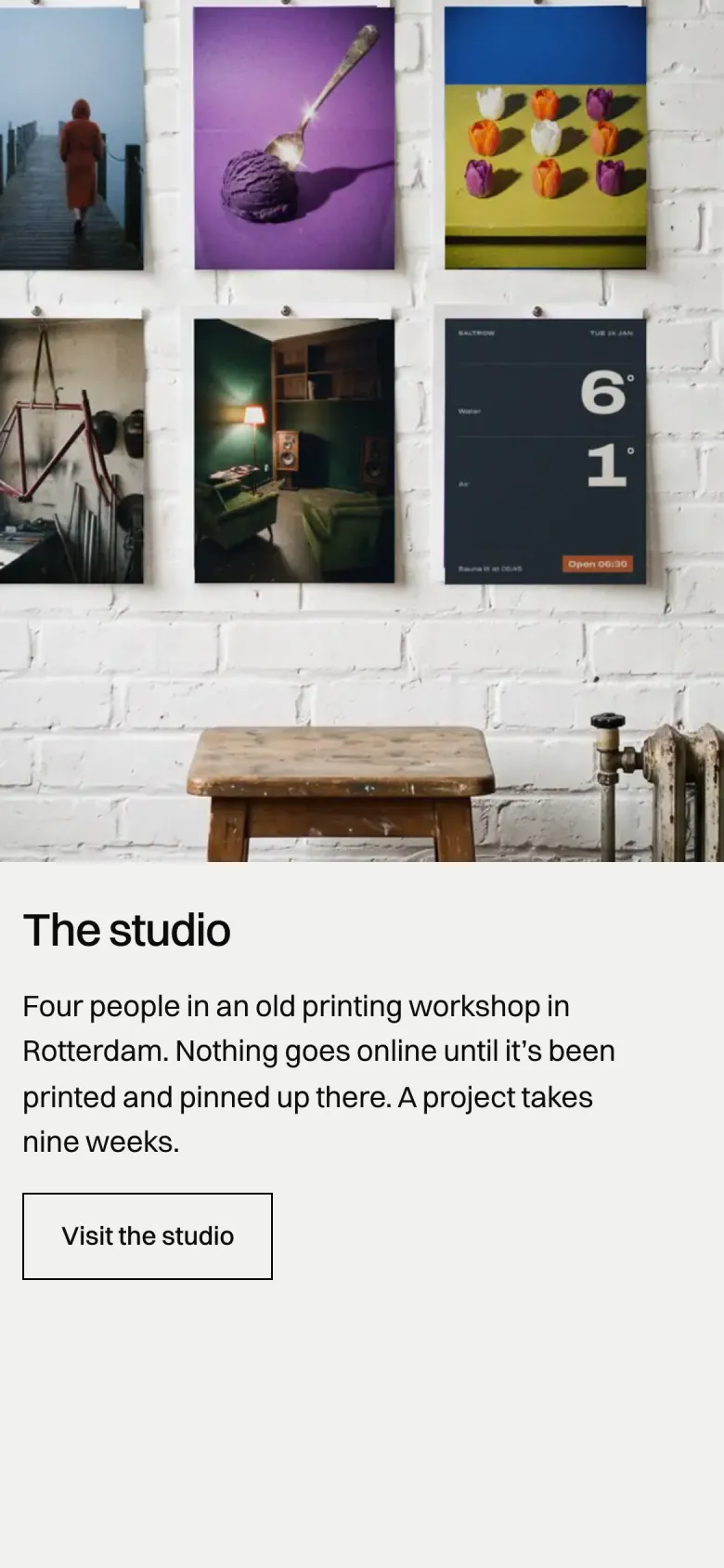
The studio pins its work up the way a studio does before a feed goes live. The prints in that photo are the site's own posts, composited onto the wall with their light matched, so they read down to the type.

Colour and type

The palette and typefaces Mullion ships with.

Switzer

  • Glass#F1F1EF
  • Sash#0C0C0C
  • Muted#5D5E60
  • Pane#E6E6E3

Up close

  • Mullion, screen 1
  • Mullion, screen 2
  • Mullion, screen 3
  • Mullion, screen 4

On the phone

Most visitors meet Mullion on a phone, so the phone layout was designed, not squeezed.

  • Mullion on a phone, screen 1
  • Mullion on a phone, screen 2
  • Mullion on a phone, screen 3
client feeds, each launched as a full grid
5
bars in the name, three panes on every page
2
phone mockups: the page itself is the grid
0

Want a site like this for your business?

Tell me what you do and who it is for. You get a free first call and a clear quote.

Start a project