Start a project
All work

Client site Home builder · Greater Toronto Area · 2026

Southbury Homes

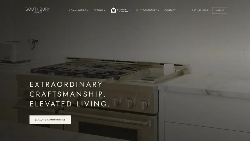
Quiet type, generous space, and photography given room to breathe.

Recorded from the live site at southburyhomes.ca

The brief

Southbury builds homes across the Greater Toronto Area and wanted a site as considered as the houses: calm, warm, and in no hurry to sell you anything.

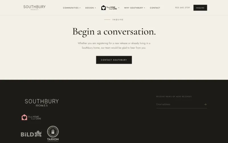
The old site did the job; it did not do the homes justice. Southbury needed a brand site that let the photography breathe, introduced each community without a brochure's worth of copy, gave its two homeowner programs the weight they deserve, and made an inquiry feel like a conversation rather than a form.

Client
Southbury Homes
Role
Web design, Development, Art direction
Built with
HTML, CSS, JavaScript, Vercel
Typefaces
Cormorant Garamond and Jost

How it was made

  1. The palette of the show home

    Bone, paper, umber and a single bronze line. The site and the show home agree.

  2. Programs, not footnotes

    Inquiries land in the sales inbox in the order the team needs them.

Southbury Homes: Homes that deserved better

Chapter 1 of 4

Homes that deserved better

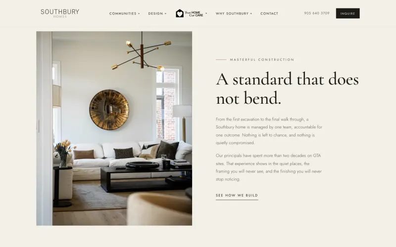
Southbury Homes builds across the Greater Toronto Area, and the houses were better than the website that sold them. Their old site did the job. It did not do the homes justice, and it did not sound like the people who build them.
Southbury Homes: Writing it like a show home

Chapter 2 of 4

Writing it like a show home

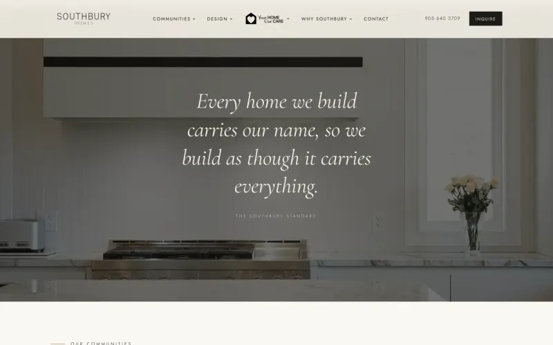
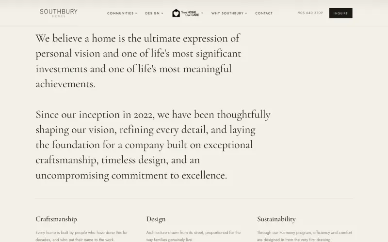
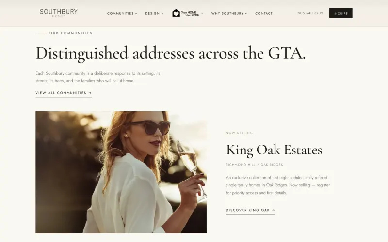
I started with the feeling of walking into one: calm, warm, nothing shouting. A Garamond for the claims, a light sans for the rest, bone and umber and a single bronze line. The site opens on what Southbury believes before it shows a single floor plan.

Southbury Homes: Communities, walked not listed

Chapter 3 of 4

Communities, walked not listed

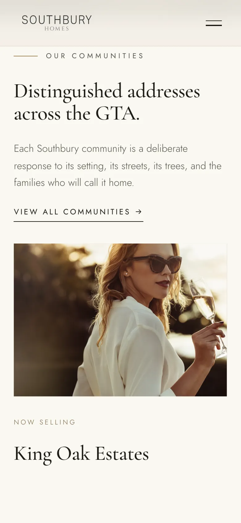
Each community gets its own page and is introduced the way a sales rep would walk you through it: the street, the setting, then the homes. King Oak Estates and Victoria Crown each carry their own registration, so interest lands where the team needs it.

Southbury Homes: The promises made visible

Chapter 4 of 4

The promises made visible

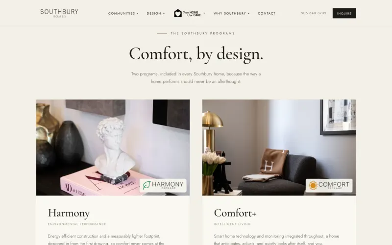
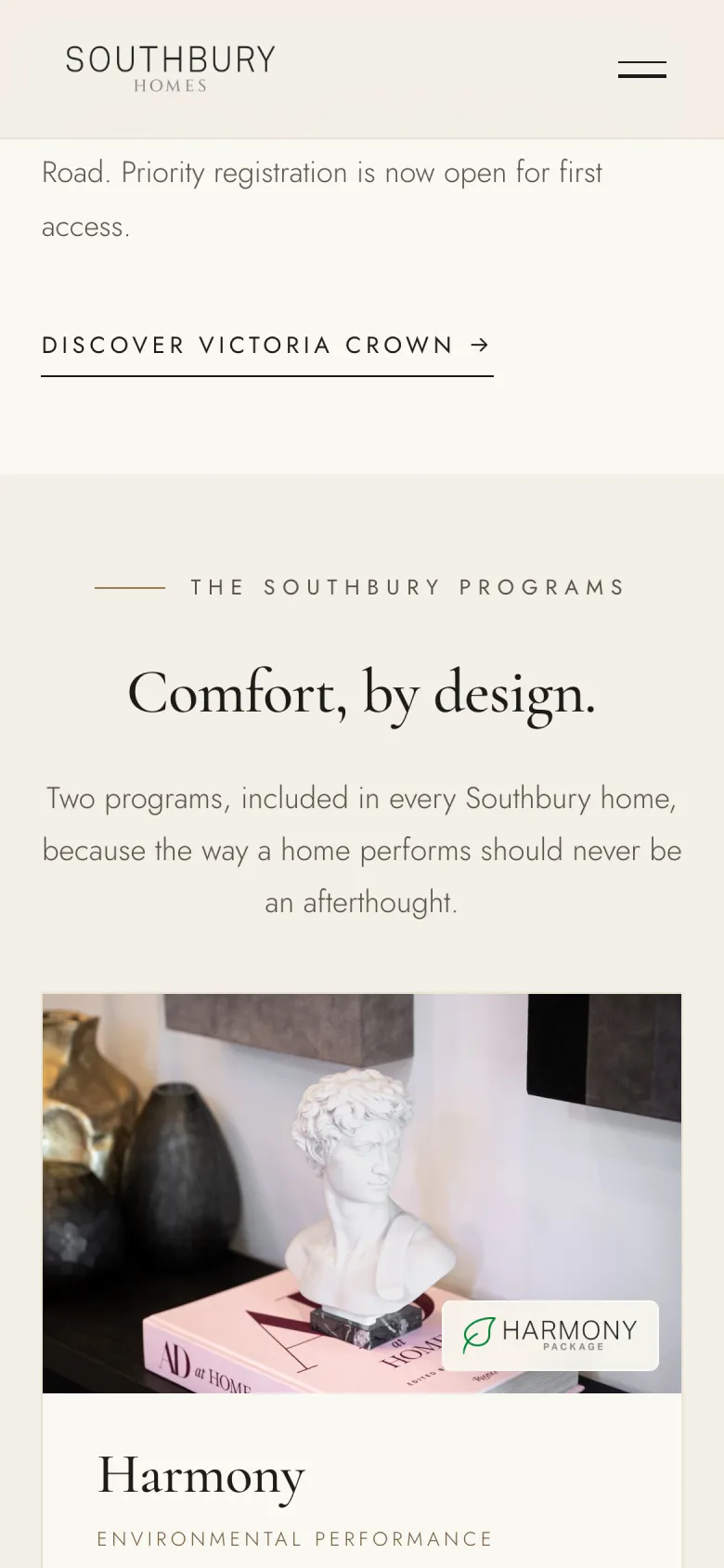
Harmony and Comfort+, the programs every Southbury home includes, used to be a footnote. Now they have their own section and page, because they are why a family chooses this builder over the one next door.

Colour and type

The palette and typefaces Southbury Homes ships with.

Cormorant Garamond and Jost

  • Umber#1D1B16
  • Bronze#9C7D51
  • Bone#F3EFE6
  • Paper#FAF8F2
  • Line#DDD6C6

Up close

  • Southbury Homes, screen 1
  • Southbury Homes, screen 2
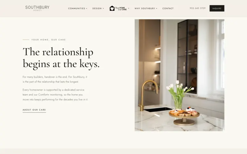
  • Southbury Homes, screen 3
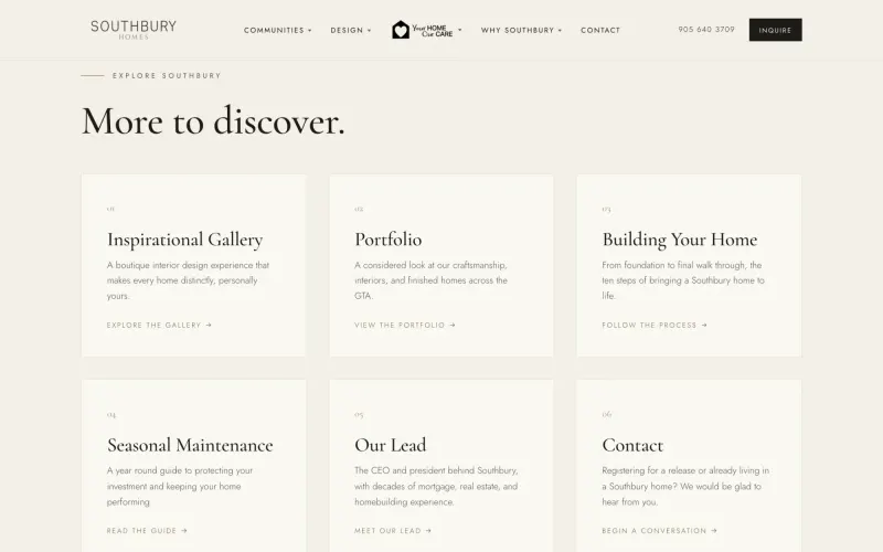
  • Southbury Homes, screen 4

On the phone

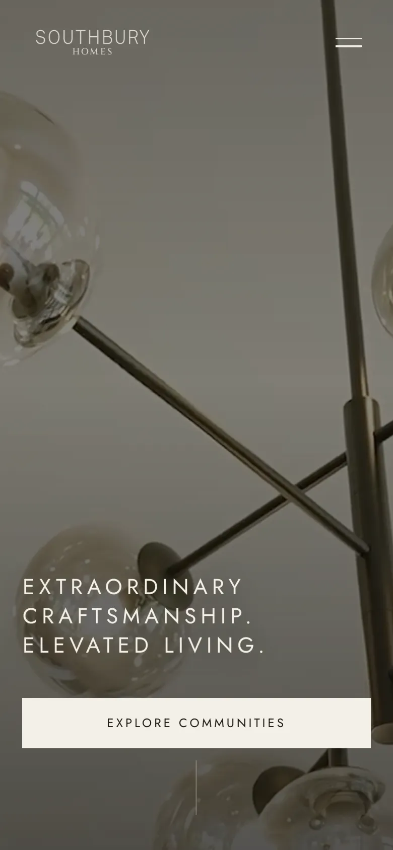
Most visitors meet Southbury Homes on a phone, so the phone layout was designed, not squeezed.

  • Southbury Homes on a phone, screen 1
  • Southbury Homes on a phone, screen 2
  • Southbury Homes on a phone, screen 3
pages, written by hand
11
community pages with their own registration
2
templates or page builders
0

Want a site like this for your business?

Tell me what you do and who it is for. You get a free first call and a clear quote.

Start a project