Start a project
All work

Client site Digital marketing agency · Toronto · 2026

Stellr Media

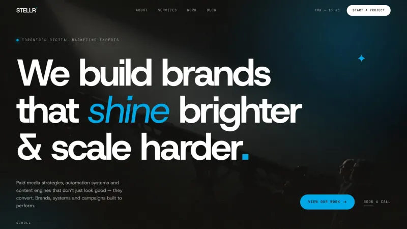
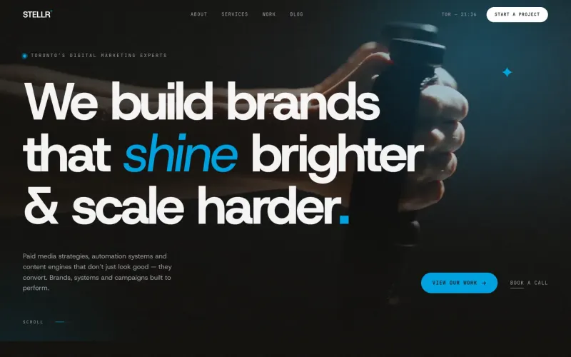
Brands that shine brighter and scale harder. Dark, fast, one line of type.

Recorded from the live site at stellrmedia.com

The brief

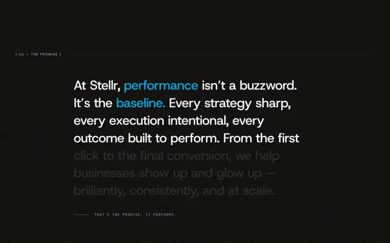
Stellr runs performance campaigns for fitness, wellness and real estate brands. Its site had to look as sharp as the ads it buys: dark, fast, and built around one line of type.

Stellr needed a site that looked like an agency that ships, not one that decorates. The client wall had to do the talking, the services had to do the convincing, and the whole thing had to load fast enough on a phone that a prospect clicking from an ad never waits. One typeface, one cyan accent, and nothing that does not earn its place.

Client
Stellr Media
Role
Web design, Development, Motion
Built with
HTML, CSS, JavaScript, Vercel
Typefaces
Host Grotesk

How it was made

  1. The wall under the claim

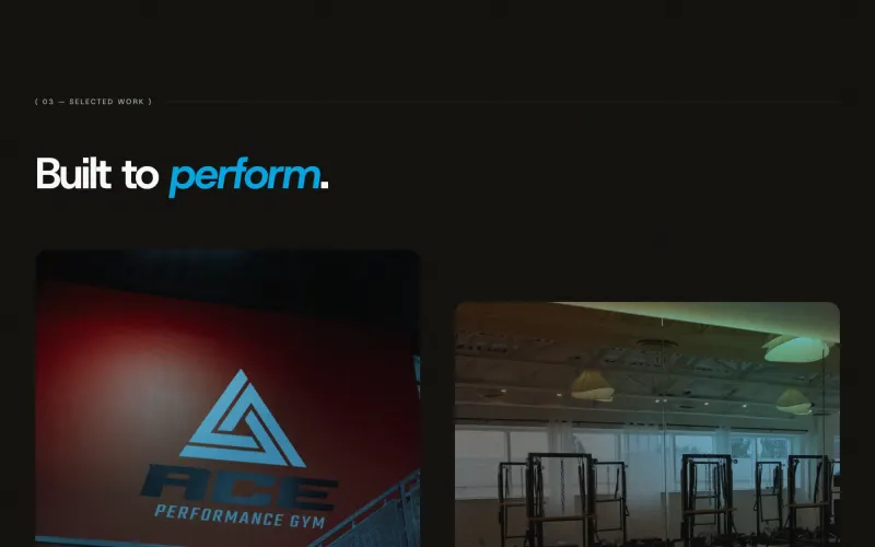
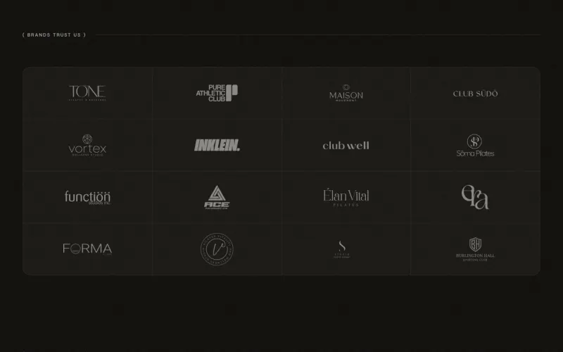
    Twelve client marks sit on a hairline grid directly under the promise, so the first thing a prospect sees after the claim is who already said yes.

  2. Services as a list, not a grid

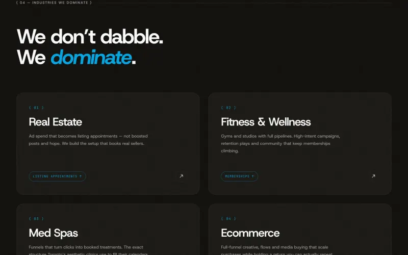
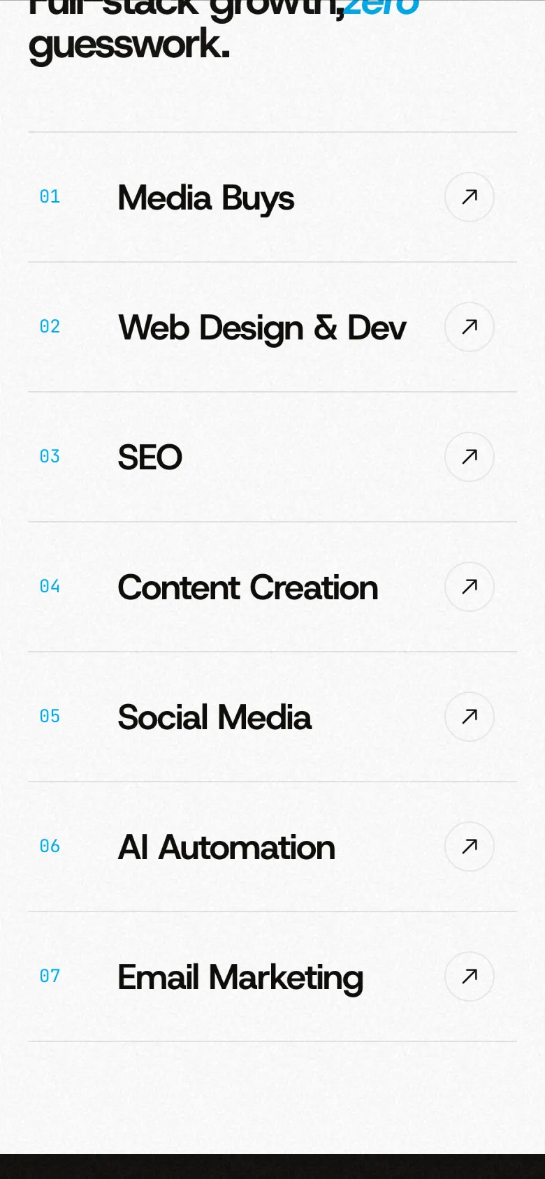
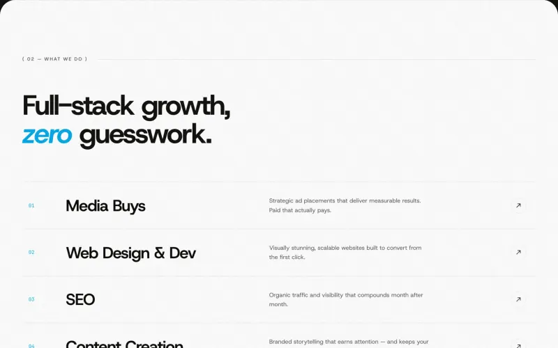
    Seven services in a numbered list, each row lighting on hover. Then the work, the industries, and a closing line that tells you to email: stop guessing, start scaling.

Stellr Media: My own agency, under my own rules

Chapter 1 of 4

My own agency, under my own rules

Stellr Media is the agency I run, buying media and building funnels for fitness, wellness and real estate brands. Its site had to look as sharp as the ads it buys, and load fast enough that a prospect clicking from one of those ads never waits.
Stellr Media: One line of type

Chapter 2 of 4

One line of type

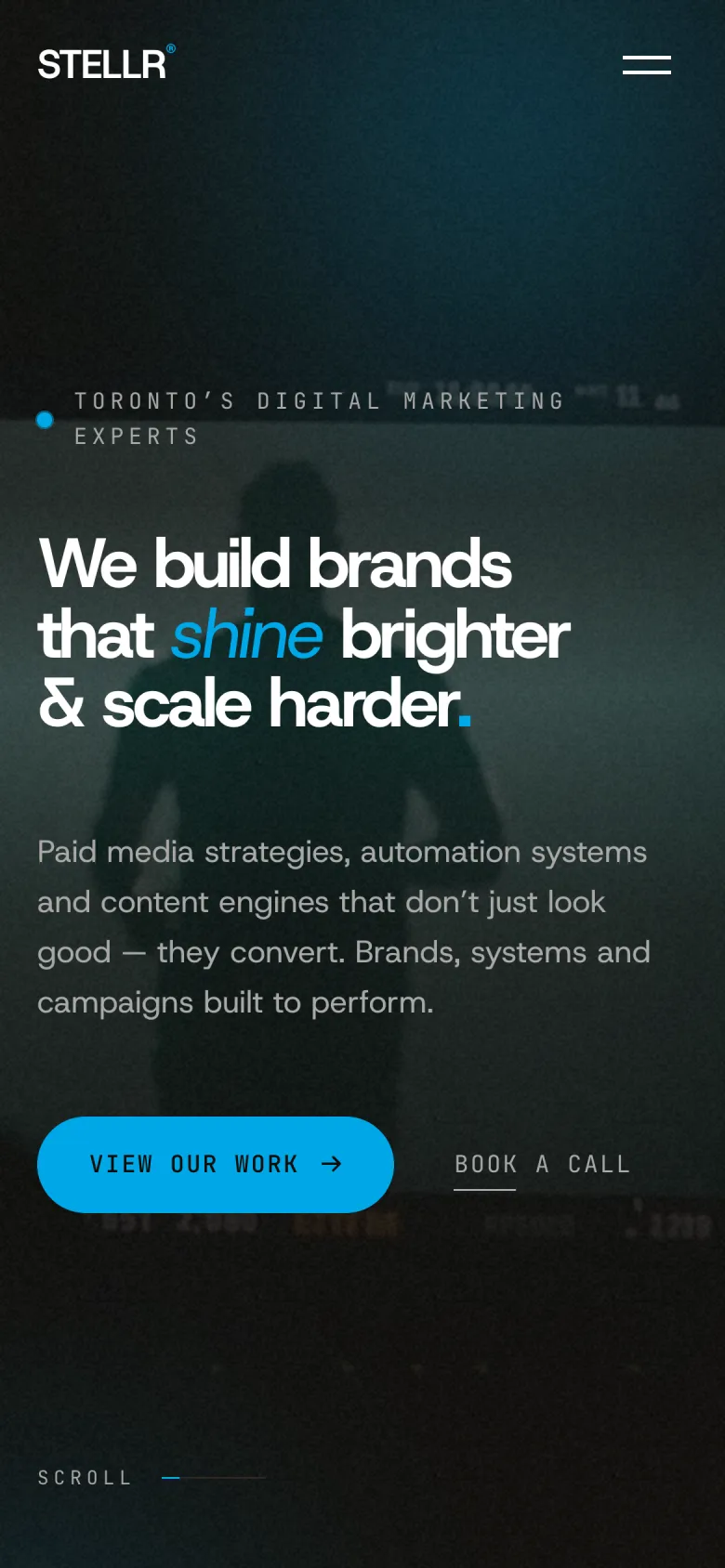
One grotesk at one heavy weight, set tight, with the word shine in cyan italic. The black ground lets that single accent do all the pointing: we build brands that shine brighter and scale harder.

Stellr Media: Proof before promises

Chapter 3 of 4

Proof before promises

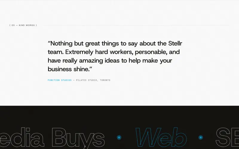
The client wall sits directly under the claim, twelve marks on a hairline grid, so the first thing a prospect sees after the promise is who already said yes. Then seven services, numbered, each lighting up as you read.

Stellr Media: Stop guessing, start scaling

Chapter 4 of 4

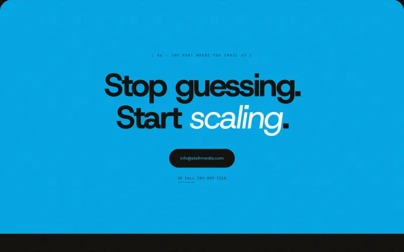
Stop guessing, start scaling

It ends on a cyan field and one instruction. No form maze, just an email and a call link. For an agency that sells performance, the site is the first campaign a client ever sees.

Colour and type

The palette and typefaces Stellr Media ships with.

Host Grotesk

  • Night#0E0D0A
  • Graphite#181612
  • Signal cyan#00A8E8
  • White#FFFFFF
  • Smoke#A9A9A9

Up close

  • Stellr Media, screen 1
  • Stellr Media, screen 2
  • Stellr Media, screen 3
  • Stellr Media, screen 4

On the phone

Most visitors meet Stellr Media on a phone, so the phone layout was designed, not squeezed.

  • Stellr Media on a phone, screen 1
  • Stellr Media on a phone, screen 2
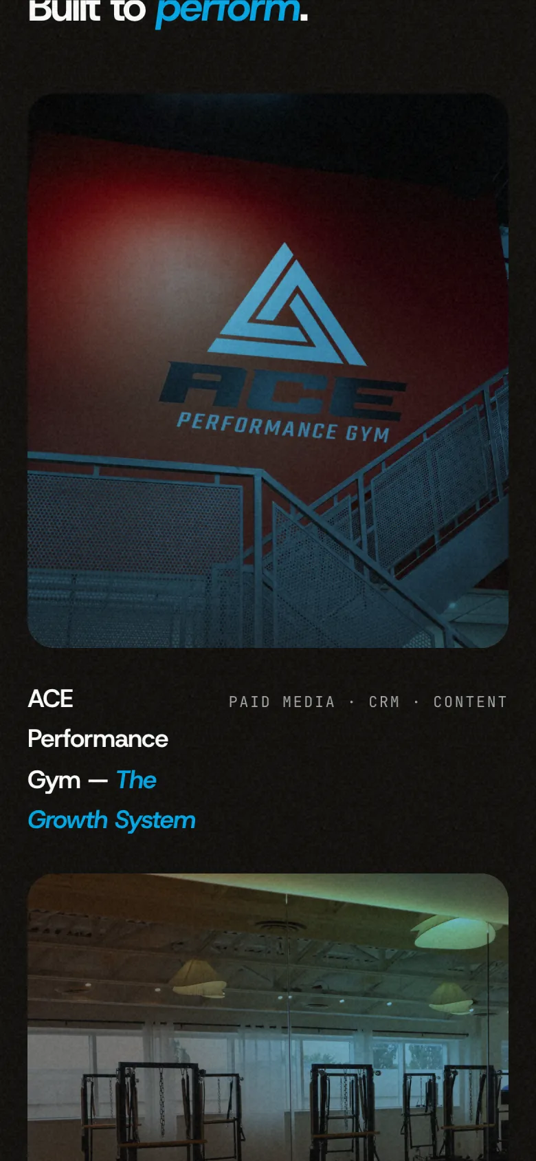
  • Stellr Media on a phone, screen 3
client marks on the wall
12
services, one numbered list
7
typeface, one weight, one accent
1

Want a site like this for your business?

Tell me what you do and who it is for. You get a free first call and a clear quote.

Start a project