Start a project
All work

Client site Social media agency · Toronto · 2026

Socialite Group

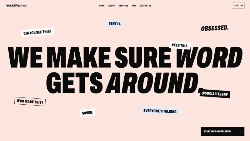
We make sure word gets around. A rebrand and a site for a Toronto social agency.

Recorded from the live site at socialitegrp.com

The brief

Socialite makes brands worth talking about. Its own brand had to be the proof: loud where it counts, tasteful everywhere else, and impossible to mistake for another agency.

Socialite Group is a Toronto social media and creative agency working with fitness, beauty, hospitality, fashion and real estate brands. It had the work and the clients but no voice of its own. The brief was a rebrand first, then a site built on the same system, so the identity, the deck and the website all speak with one voice.

Client
Socialite Group
Role
Brand identity, Web design, Development
Built with
HTML, CSS, JavaScript, Vercel
Typefaces
Archivo and Instrument Sans

How it was made

  1. One line to build on

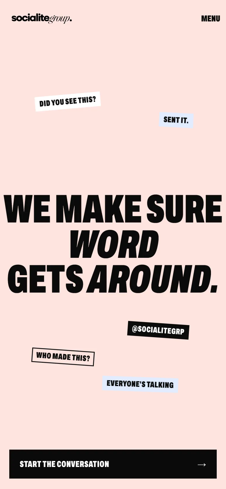
    We make sure word gets around. The line came first, and the rest followed it: heavy Archivo italics that sound like word of mouth, with a Bodoni italic for the words that should feel whispered.

  2. Blush, blue, black

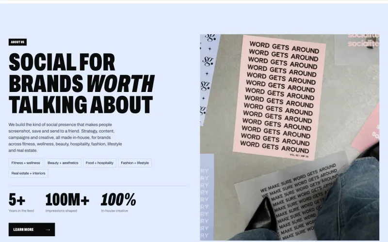
    Black ink, white, and two grounds, blush and blue, that rotate section by section. Stickers and collaged images do the shouting, so the type never has to.

Socialite Group: An agency without a voice

Chapter 1 of 4

An agency without a voice

Socialite had good clients and good work, and a brand that could have belonged to anyone. For an agency that sells attention, that was the problem to solve first, so the project started as a rebrand, not a website.

Socialite Group: Word of mouth, as a brand

Chapter 2 of 4

Word of mouth, as a brand

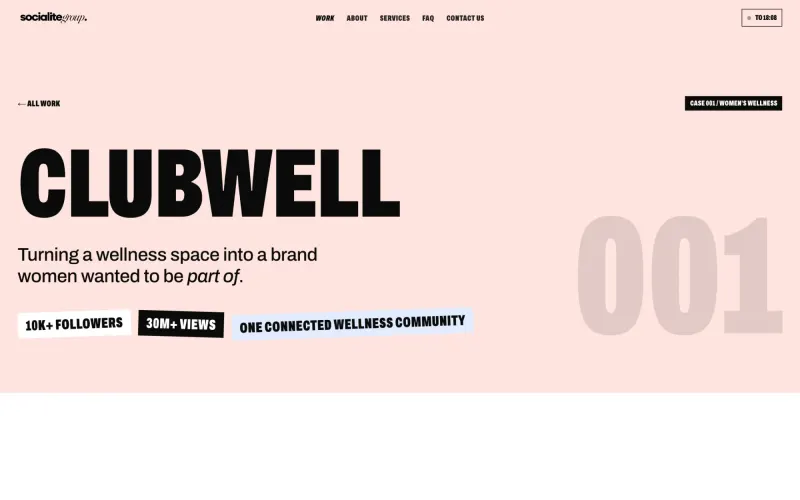
Everything grew from one line: we make sure word gets around. Heavy italic type, stickers and collaged photos make the site feel like something passed hand to hand, the way a recommendation is.

Socialite Group: Blush, blue and black

Chapter 3 of 4

Blush, blue and black

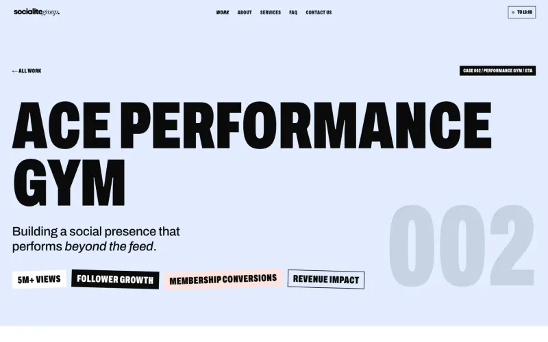
The identity deck locked the system before a page was built: black ink, white, a blush ground and a blue ground that take turns down the page. The site and the deck share every token, so the brand reads the same everywhere it shows up.

Socialite Group: Show the receipts

Chapter 4 of 4

Show the receipts

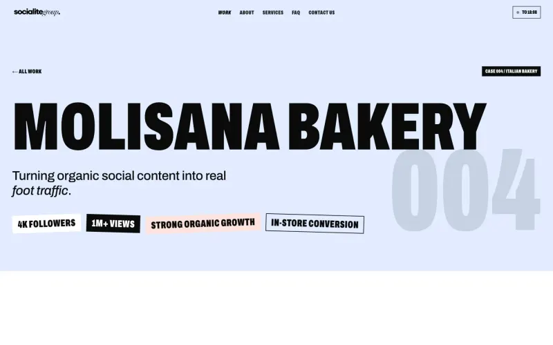
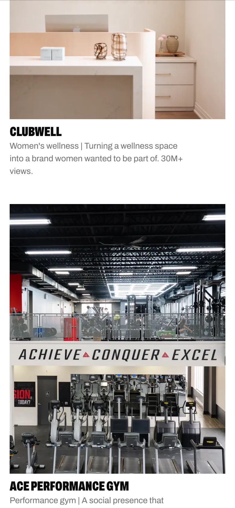
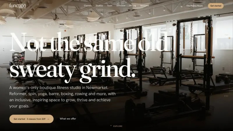
Agencies love to describe themselves. Socialite shows its clients instead, four case studies told in the clients' words under a section called The Receipts, followed by straight answers about cost and timelines before anyone has to ask.

Colour and type

The palette and typefaces Socialite Group ships with.

Archivo and Instrument Sans

  • Ink#0B0B0B
  • White#FFFFFF
  • Blush#FEE4DF
  • Blue#E1ECFF

Up close

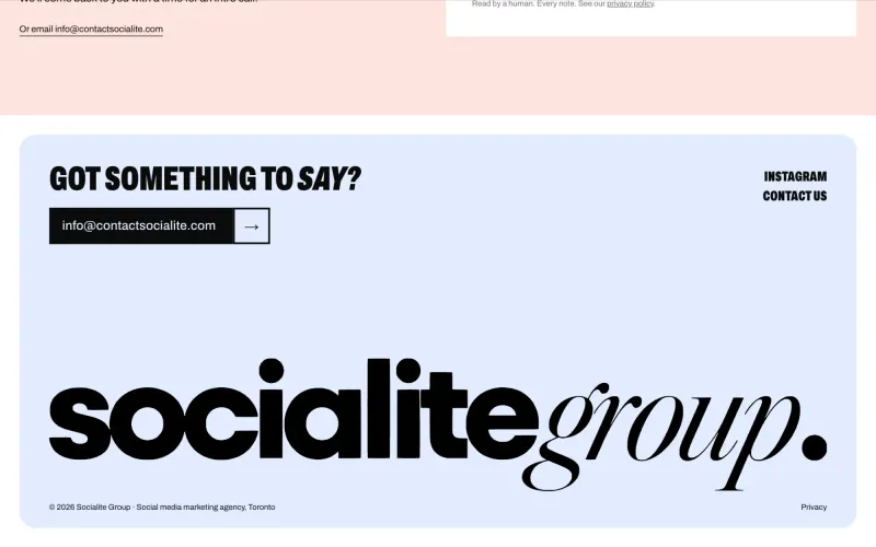
  • Socialite Group, screen 1
  • Socialite Group, screen 2
  • Socialite Group, screen 3
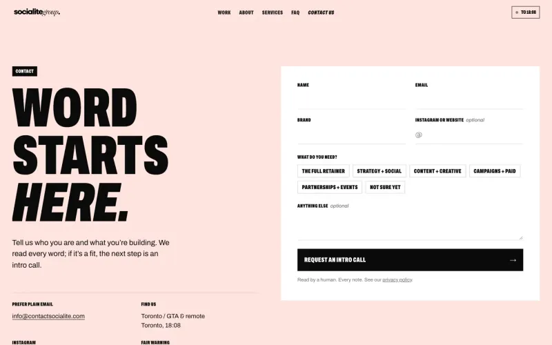
  • Socialite Group, screen 4

On the phone

Most visitors meet Socialite Group on a phone, so the phone layout was designed, not squeezed.

  • Socialite Group on a phone, screen 1
  • Socialite Group on a phone, screen 2
  • Socialite Group on a phone, screen 3
client stories, in the clients' own words
4
brand system shared by the deck and the site
1
templates or page builders
0

Want a site like this for your business?

Tell me what you do and who it is for. You get a free first call and a clear quote.

Start a project